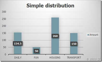
MS Office has provided us with a lot of options to create graphs - Bar/Column charts, Pie charts, Line charts and Area charts are just to name a few. Each one is important at different times, to show different things. For example, to show the different categories of spends in a month and know the amount spent on each one, the best one (as we would think) would be a column-chart:-

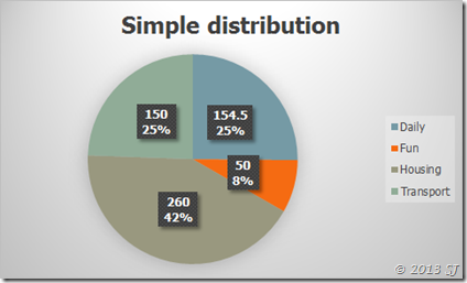
But what the chart doesn’t do is show how much more or how much less was spent on one category than the other. The following chart does both the jobs:

It gives the value and the percentage split as well. As you see, everything about the expenses last month is answered. You can make a judgmental call from here. Chart formatting is what comes in handy for cases like these. We have enormous number of options for showing the things we want in a particular way – colours/labels/size/borders/etc.
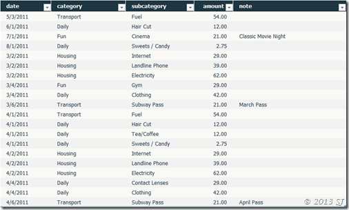
For some exercise, I had wanted to show the percentage distribution in a bar chart a few weeks back. Lets take this data for example:

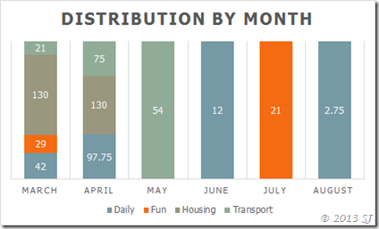
I had wanted to show the change in distribution of categories over months. And this is all that I could get to using the direct chart making techniques available in Excel.

But this did not give me the percentage distribution of the different categories at a monthly level. I modified the datasheet the following way (making sure the user doesn’t get to see it by re-colouring the font white).

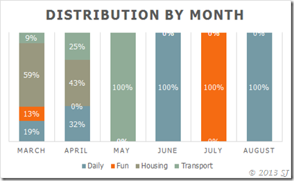
And here is the chart with the information we want to convey:

Take care!

